
Activity A: Line Design — Variety & Unity
Graphic Design Assignment
Due Date
Week 3
Total Points
5 points
Status
UpcomingIn this project, you'll design a composition built entirely from black ink lines on a grid. The challenge is to create variety — through direction, thickness, and pattern — while keeping the overall piece feeling unified as a single design.
The Lines
Work only in black ink, drawn directly onto the board. There should be no actual gray anywhere in the piece. Any impression of gray or tonal value must be created optically — by how densely, thinly, or closely you place your black lines. Vary your lines across sections using:
- Direction (horizontal, vertical, diagonal, curved)
- Thickness (hairline to bold)
- Pattern (parallel lines, crosshatching, stippled dashes, wavy repetition, etc.)
Construction Options
Choose either method, or combine both:
- Draw directly onto your board in ink.
- Draw your line patterns on separate paper, cut them out, and glue them onto the board (collage method).
Goal
The main objective is variety within unity. Each section of the grid should look distinct from its neighbors, but the piece as a whole should read as one coherent composition — not a random assortment of unrelated parts.
To give your composition emotional depth, choose one of the following themes as the basis for your line design:
Emotional States / Moods
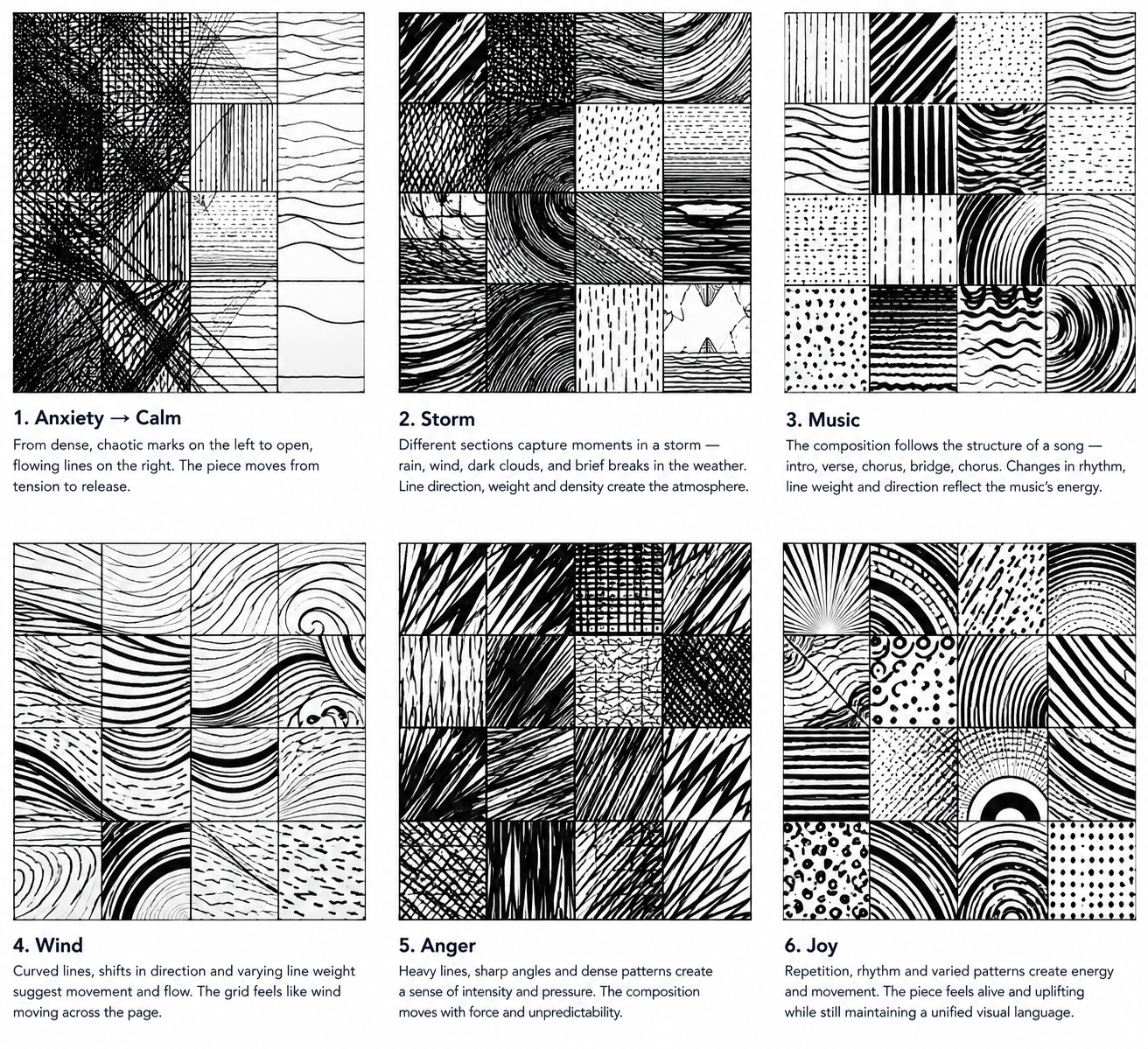
Translate a specific feeling into line — anxiety, calm, anger, grief, joy, chaos, tension release. Direction and density map directly onto emotional register: jagged diagonals read as agitation, tight parallel hatching reads as tension, loose curves read as ease. You may draw a word from a hat or work from a personal experience.
Sound / Music Translation
Listen to a piece of music (your choice, or one meaningful to you) and translate its rhythm, tempo, and dynamics into line variety across the grid. Loud sections become bold, dense lines; quiet sections become sparse, thin ones. The structure of the song naturally guides your variety within unity.
Environmental / Weather
Storm, stillness, wind, drought — atmospheric conditions bridge abstract mark-making and felt emotion. This is a good option if “express a feeling” feels too open-ended.
Here are six sample compositions showing how different themes translate into line variety while staying unified. Notice how each grid reads as one coherent piece even as individual sections differ in direction, weight, and density.
- You can change the grid by adjusting row sizes and direction (some rows can go up and down, others side to side).
- The main goal is to create variety while keeping the whole piece unified. Use different line directions, thicknesses, and patterns.
- Use black ink to draw lines directly onto your board. There should be no actual gray—any gray effect comes from how you place the lines.
- You can also draw your line designs on separate paper, cut them out, and glue them onto the board.
Must be presented & delivered on paper in class.
Send your submission via email to mitchellh2@cnc.bc.ca. Please CC any other instructors for this course.